Chances are if you’ve been on the Internet long enough, you’ve encountered a dreaded “404” error page. Also known as a “404 Page Not Found,” this error happens when you enter a URL that can’t be located – because it’s been deleted or moved, or because it never existed in the first place. In many cases, the error looks something like this:

And chances are if you’ve been following me long enough, or have heard one of my keynote speeches or read my book, you know that I look at every communication opportunity with a customer as an opportunity to create an experience. Even 404 error pages.
Think about it: If someone lands on a 404 error page on your site, it means they’re lost. It could be their fault (they typed the URL incorrectly) or it could be your fault (you took down an old page or moved it to a new URL without a redirect), but either way: the customer landed somewhere that they didn’t intend.
So you can either let them continue to struggle, or you can lighten up the experience a little and then help get them back on their way. It’s a perfect opportunity to practice being Witty, which I define as “clever, using language to your advantage, and refusing to be boring.”
You don’t have to be a web designer to create a 404 error page. Most websites have a default error page that can be edited, and there are WordPress plugins that you can use if you are managing your own site.
I’ve collected a few of my favorite examples below, along with some commentary. Hopefully they provide some inspiration for you to create a 404 error page that you can make uniquely your own.

I’ve written about Amazon’s customer service tenets, and understanding them makes it clear why the e-commerce giant’s 404 error page is so remarkable. Each time you land on a bad URL on Amazon’s site (just try www.amazon.com/error for example), you get a picture of an adorable dog that is an actual Amazon employee’s pet. Best of all, you’ll find a different dog each time! There is also a link to an article about the “8,000 dogs that ‘work’ at Amazon,” a reference to the pet-friendly policies at Amazon’s headquarters. Finally, note the sentence that helps customers get back to a familiar page: “Try searching or go to Amazon’s home page.”

When you land on an error page on Twitter’s site, you’re greeted with the sad sight of a dropped ice cream cone – a fairly apt metaphor for losing your way on a website. The text reads: “I scream, you scream, we all scream… for us to fix this page. We’ll stop making jokes and get things up and running soon.” It doesn’t have any obvious connection to the social media site’s brand, but it’s clever and memorable nonetheless.

Sunbasket, a healthy food meal delivery company, uses Witty language in many places across the customer journey. The shipping boxes have a haiku on them; e-mails and instructional inserts are playful and fun. So it stands to reason that the company would have some fun with its 404 Error Page, and a broken egg is the perfect metaphor for its cooking-focused brand. Note again the sentences at the bottom that help direct the customer back to safety.

If you’re the leading stock market research site, you might as well use a stock market pun on your error page. Morningstar does this perfectly with “Like guarantees of future returns, this page doesn’t exist.” This is, of course, a reference to the common refrain of all stock and fun prospectuses: “Past performance is no guarantee of future results.”

Though perhaps not technically a “404” error page because it’s displayed on a streaming TV channel, NBC’s Peacock streaming service does an amazing job of helping the viewer not lose their cool when they can’t watch their favorite program. I mean, who could possibly be upset while staring into the adorably sad eyes of “Puss in Boots” from Shrek? (Shrek was distributed by DreamWorks Pictures, which is owned by Universal Pictures, which is owned by NBCUniversal, which is why they are able to use the copyrighted image.) It’s amazing how a picture like this one can be an instant mood-changer, even when something is going wrong.

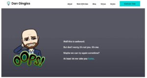
Always one to practice what I preach, my own 404 error page is meant to cause a chuckle and then gently redirect the user back to the home page. The combination of the silly Bitmoji and the metaphor of a date gone wrong is a reflection of my sense of humor, and even if you don’t know that sense of humor personally, you’ll probably still get a kick out of landing on the wrong page of my website.
So stop what you’re doing and go to your own website right now. After the .com or .org or .whatever, add /error and see what happens. If all you see is “Page Not Found,” you’re missing a golden opportunity to create an unexpected customer experience. Go ahead, have some fun and change the page. Then sit back and wait for the appreciative customer comments to roll in.
Have a favorite 404 error page? Share it with me @dgingiss on Twitter or Instagram!